Use Code: WELCOME20 to Enjoy a 20% Discount Before Nov 10th.

Matching or Contrasting? Exploring Dial and Leather Strap Color Combinations

A leather watch strap brings a softer visual texture to an outfit, with colors and finishes that can sit comfortably alongside everyday clothes. Smooth leather can echo the clean surface of a handbag, while a more visible grain can feel at home beside knitwear or denim. This variety makes leather-strap watches appealing when you want an accessory that feels considered without requiring a completely different wardrobe. The relationship between the dial and strap is a useful place to begin.
Perhaps you are drawn to a brown dial that blends gently into a brown strap. Or you prefer the small pool of light created by a cream dial against darker leather. Both approaches can be easy to wear. Matching colors usually make the watch feel more continuous, while contrasting colors give the eye a clearer place to pause. Neither effect requires exact color matching with your clothes.
The most useful choice depends on what you want to notice first: the watch as a whole, its dial, or a touch of color at your wrist. Looking at lightness, warmth, and texture helps make that choice more concrete.
What Makes Dial and Strap Colors Work Together?
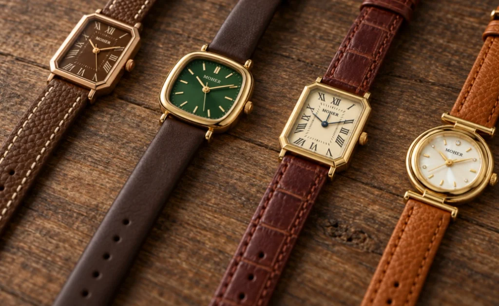
Start with light and dark before worrying about color names. A pale dial against dark leather creates an obvious boundary, even when both colors belong to a warm palette. A dark dial with a similarly dark strap may look quieter from a distance, despite the two having different hues. This distinction explains why a green-and-brown combination can sometimes feel less contrasting than cream and brown.
Next, look at warmth. Brown leather may lean toward golden tan, reddish chestnut, or a cooler, muted shade. A cream dial can pick up the warmth in the first two, while a cooler grey dial may make the difference more noticeable. These are visual starting points, not fixed rules. A deliberate shift between warm and cool can be attractive when the remaining details are restrained.
Color intensity matters too. Muted green and brown can look settled together because neither color demands much attention. A brighter green introduces a different energy, even beside the same brown. When comparing watches, try to judge the complete combination rather than deciding that every green dial, or every brown strap, will create the same effect.
A useful final check is to imagine the watch beside a familiar sleeve. A white shirt makes dark leather more noticeable; a brown sweater can let it blend in. The combination stays the same, but its surroundings change how strongly you see it.
When comparing photographs, look for views taken in similar lighting. A reflection can make a dial appear much lighter than it looks from another angle, and warm indoor light can change the apparent balance with brown leather. Compare several images before deciding that two colors match closely. The aim is to understand the overall relationship, allowing for the changes you will see as your wrist moves.
Matching Tones for a Quiet, Cohesive Look
Similar Colors with Different Depths
Matching a watch dial and leather strap does not require an identical shade. Related colors can create continuity while still leaving enough difference to show where the dial ends and the strap begins. Think of the way a chocolate-colored bag works with a chestnut belt. The connection is clear, yet each piece retains its own character. A watch can use the same approach on a smaller scale.
For someone who enjoys earthy clothes, subtle variations within a brown palette can continue the feeling of a camel coat or oatmeal knit without making the wrist disappear into the outfit. The small differences become more noticeable as you look closer. This works particularly well when you already enjoy texture and layering, because the watch can contribute another shade without introducing an unrelated color.
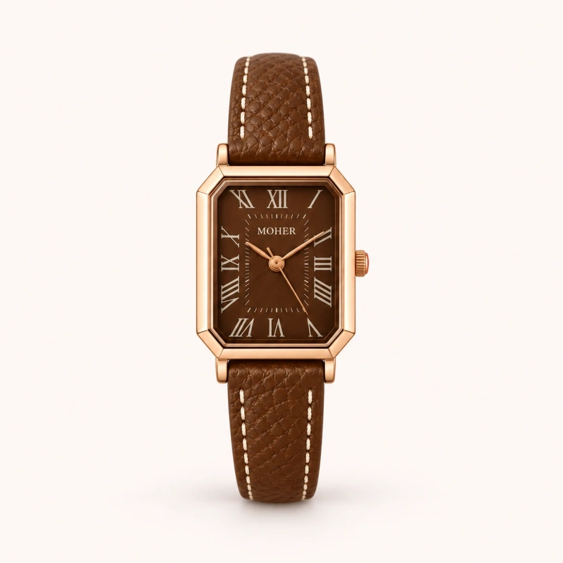
The same idea can suit someone who prefers an uncomplicated everyday accessory. If the dial and strap already feel connected, there is less pressure to repeat both colors elsewhere. A neutral shirt and trousers may be enough. A matching palette can also sit beside patterned clothing without adding another strong color division, although the overall effect still depends on shine and detailing.
Texture Keeps Similar Colors Interesting
When the colors are close, surfaces do more of the work. A dial that catches the light can remain distinct from leather with a quieter finish. Fine grain or restrained stitching can add interest around the wrist without interrupting the color connection. You do not need every surface to shine equally for the combination to feel complete.
If a tonal combination looks too flat to you, try a little more difference in lightness before choosing a completely new color. A slightly lighter dial, a deeper strap, or a subtle metallic edge can be enough to give the eye something to follow.
Matching tones also leave some flexibility when your shoes and bag differ. A brown watch does not have to reproduce both shades. It can relate loosely to one, while the other remains a separate neutral. Looking for a shared warm or muted quality is often more practical than trying to assemble several leather accessories in precisely the same brown.
Gentle Contrasts That Still Feel Easy to Wear
A Light Dial with a Darker Strap
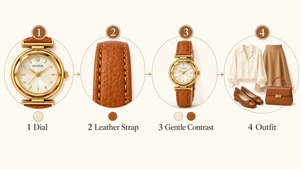
A light dial gives a darker leather strap a clear visual center. The contrast can feel crisp with white, softer with cream, or warmer with a pale golden tone. These differences are small enough to overlook in isolation, yet they can change how the watch sits beside clothing. Cream often feels comfortable with off-white knitwear, while a brighter white can echo the clean appearance of a cotton shirt.
If you prefer a gentle transition, the soft contrast of cream and warm brown offers a useful direction. It introduces light at the wrist while keeping the surrounding colors familiar. Beside beige trousers and a white blouse, that relationship can connect the softer tones without needing a matching bag. With dark jeans, the same contrast can give the outfit a lighter finishing detail.
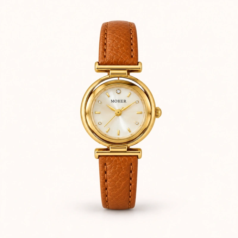
The important question is how distinct you want the dial to look. A very dark strap around a pale dial produces a stronger boundary than a medium brown strap would. If your outfit already contains bold contrasts, either can work, but repeating that level of contrast intentionally often makes the choice feel more connected to the clothes.
A Darker Dial with a Softer Surrounding Tone
The reverse arrangement changes the emphasis. A deeper dial beside lighter or more muted leather can draw attention inward, while the strap feels less visually heavy. This may appeal if you like a darker face but do not want the entire watch to read as one dark shape. The colors can remain understated even when the difference in lightness is clear.
Try viewing both arrangements with the sleeve you wear most often. This is more helpful than treating contrast as automatically casual or formal. A simple dial with a clear contrast can look composed, while added shine or prominent stitching can shift the character of an otherwise similar pairing.
Remember that contrast between the strap and dial concerns the overall appearance of the watch. Reading the time depends more directly on how clearly the hands and markers stand out from the dial itself. A pale face with pale hands may offer less visual separation than you expect, even when the surrounding leather is very dark. Consider those two kinds of contrast separately.
A Touch of Color with a Grounded Leather Strap
A colored dial can be easier to style when the leather strap gives it a familiar setting. Brown, black, and muted neutral shades offer a connection to clothes and accessories you may already wear. That leaves the dial free to introduce a small difference. You can enjoy color at the wrist without turning it into a requirement for the rest of your outfit.
For example, a hint of green grounded by brown leather can sit comfortably beside a cream shirt or a simple navy sweater. The brown provides continuity with familiar neutral pieces, while the green adds a separate point of interest. There is no need to find an exactly matching green garment. Keeping the surrounding clothes uncomplicated gives the color enough space to be noticed.
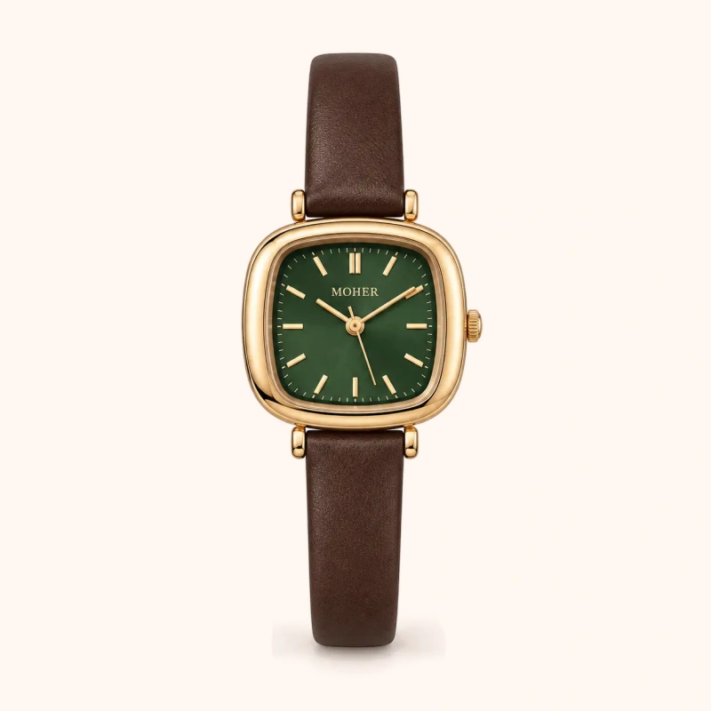
The intensity of the dial helps determine how much attention it attracts. A muted shade may feel close to the rest of an earthy outfit; a clearer, brighter shade may become its main accent. Neither approach requires additional color elsewhere. If you do want a connection, a small detail in a scarf or print can be enough, and it need not repeat the exact shade.
You can also let the strap carry the color and keep the dial quiet. A deeper red or burgundy beside a pale dial shifts the emphasis toward the leather. This can suit someone who likes colorful accessories but prefers a restrained watch face. It also creates a useful middle ground between a wholly neutral watch and a combination with several competing colors.
If both the dial and strap contain noticeable color, begin with a simple outfit when judging the pairing. This makes it easier to decide whether you enjoy the colors together, independent of a patterned sleeve or a bright handbag. You can then add one familiar accessory at a time. The combination may need very little else to feel finished.
The Small Details That Tie the Colors Together
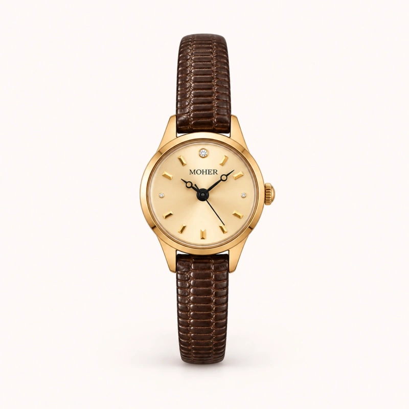
The case sits between the dial and strap, so its color can influence how the two relate. A warm metallic edge may continue the warmth of brown leather into a cream or gold-toned dial. A silver-toned edge can make that transition feel cooler or more distinct. Look at the whole watch before judging the pairing from the dial and strap alone.
Hands and hour markers can create smaller connections. Dark markings on a pale dial may echo a deeper strap, while warmer details can relate to a brown or reddish tone. These repetitions do not have to be obvious. Sometimes a small shared color is enough to make a contrasting combination feel considered, particularly when the larger surfaces are otherwise simple.
Texture and stitching deserve the same attention. Pale stitching introduces a light outline even on dark leather, while stitching close to the strap color keeps the surface more continuous. A glossy finish may make color differences more noticeable as light moves across it. When choosing between similar palettes, these details can explain why one feels quieter and the other more decorative.
Finding a Combination That Fits Your Wardrobe
Mostly Black, White, and Grey
If most of your clothes are black, white, and grey, decide whether you enjoy continuing that restraint or adding a warmer detail. A dark dial and dark strap can blend into a black sleeve, while a pale dial creates a more visible interruption. Brown leather is another option if you want to soften the overall impression without introducing a very bright accent.
A little color can also work within this wardrobe. Against a grey knit, a restrained burgundy accent balanced by a pale dial can introduce warmth without requiring red elsewhere. The outfit still rests on neutral clothes. Repeating the watch color in a bag is optional; leaving it as the only colored detail can be just as intentional.
Beige, Cream, and Earthy Tones
With beige and cream clothing, begin by deciding how much definition you want at the wrist. Similar warm shades can continue the softness of the outfit, while a darker strap creates an anchor. A cream dial may echo a blouse; a brown dial can deepen the palette. The clothes and watch do not have to share identical shades for the connection to be visible.
If pale layers feel too uniform, warm golden tones set against deeper brown can add definition while staying within the same general color family. This approach leaves room for a woven bag, suede shoes, or a textured coat without making every accessory match. The shared warmth connects the outfit, and differences in depth keep its individual elements visible.
Denim and Occasional Color
Denim offers a useful test for an everyday leather-strap watch because it often appears in several familiar outfits. Try imagining the same watch with jeans and a white shirt, then with a sweater you wear regularly. A combination that feels comfortable in both settings is more useful than one chosen only to match an unusual item you rarely reach for.
When you add a colorful blouse or printed scarf, choose one connection to follow. The strap might echo your shoes, or the dial might pick up a quiet shade in the print. You can also let the watch remain independent if the surrounding colors already feel balanced. A single repeated detail is often enough; every accessory does not need the same color instruction.
Before settling on a combination, think about what remains visible during a normal day. With long sleeves, you may see mostly the dial and a short section of strap. With shorter sleeves, the leather contributes more to the outfit. Imagining both views can help you choose a balance you enjoy across seasons, rather than only in a close-up photograph.
Frequently Asked Questions
Can a Brown Leather Strap Work with a Black Dial?
Yes. Black and brown can work together, especially when you like a deeper palette. Dark brown usually creates a quieter transition, while a lighter brown makes the separation clearer. The metal around the dial and any stitching can also influence the result. Try the combination beside the clothes you wear most, rather than ruling it out because the colors are different.
Does My Watch Dial Need to Match My Clothes?
No exact match is necessary. A dial can relate to your clothes through warmth, lightness, or a small repeated color, but it can also serve as a separate accent. A neutral leather strap often helps a colored dial sit alongside everyday outfits. If you enjoy matching, keep the repetition small enough that choosing your clothes still feels easy.
Which Is Easier to Style, Matching or Contrasting Colors?
Either can be easy when it fits your usual palette. Similar dial and strap colors often feel continuous, while a gentle contrast can connect light and dark pieces within an outfit. Consider three outfits you already wear and imagine the watch with each. That practical comparison is more useful than assuming one type of combination is always more versatile.
Finding Your Own Color Balance
A pleasing dial and leather strap combination begins with noticing the relationship between its parts. Similar tones can give the watch a quiet continuity. Differences in lightness or color can bring attention to the dial, the leather, or both. Small details then help shape how that combination feels when you wear it.
Begin with the clothes you reach for most, and consider whether you want your watch to blend in or offer a little contrast. A familiar shade, a softer transition, or one carefully placed touch of color can be enough. The combination that feels natural in your daily wardrobe is the one you are most likely to enjoy wearing again.