Use Code: WELCOME20 to Enjoy a 20% Discount Before Nov 10th.

Gold or Silver? How to Choose the Right Metal Color for a Gemstone Watch

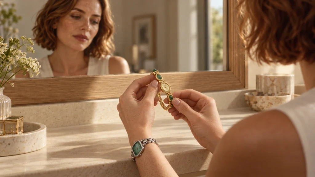
A gemstone watch can make getting dressed feel easier: one piece gives you the practicality of a watch, the decorative appeal of a bracelet, and a touch of color that makes a simple outfit feel considered. Metal links provide shine and definition, while jade, tiger’s eye, or delicate pearl details introduce a softer, more expressive element. With natural materials, variations in texture and appearance can add character to the design. Whether you wear a white shirt to work or a favorite knit at the weekend, a thoughtfully chosen watch can become the finishing detail you reach for without needing several extra accessories.
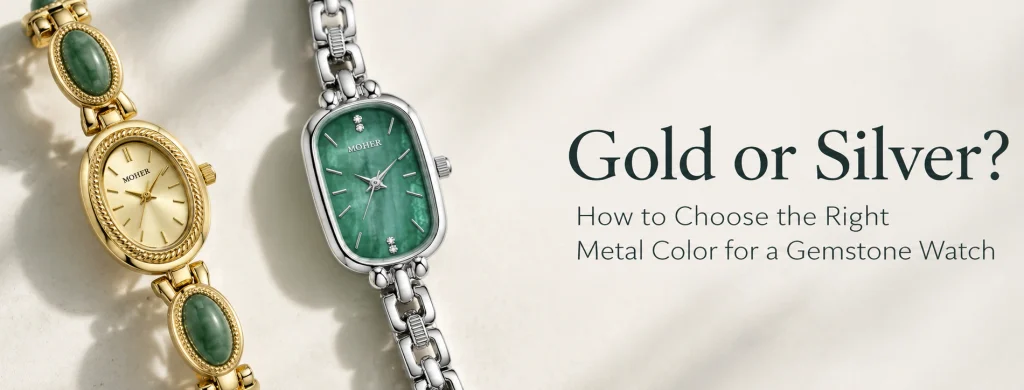
But once you find a stone color you love, another question appears: should you choose gold or silver? The metal surrounding a stone changes how the whole watch looks. It can make the color feel warmer, create a crisp contrast, or help the watch fit naturally alongside your existing jewelry. Surrounding colors can also influence how we perceive a stone’s color.
Choosing between a gold-tone and silver-tone gemstone watch becomes simpler when you consider the stone, your everyday accessories, and the clothes you actually wear. Here is how to bring those details together.
1. What Changes When You Choose Gold or Silver?
Gold-tone metal brings a warm yellow note into a design. Around a brown stone, that warmth can create continuity; around a green or blue element, it can introduce contrast. If you enjoy accessories with a rich, decorative presence, this combination may appeal to you. Even a narrow gold-tone bracelet watch can provide a noticeable finishing touch against a plain sleeve.
Silver-tone metal creates a cooler visual frame. It can work smoothly with pale greens, gray details, and blue shades, but it can also make warmer colors stand out. A silver-tone gemstone watch may suit you if you prefer a crisp accent that connects easily with gray clothing, white shirts, or silver-colored rings.
These are starting points, rather than fixed style categories. A wide, ornate silver bracelet can look more dramatic than a delicate gold chain. A small gold-tone case with minimal detailing can feel perfectly appropriate for everyday wear. Look at the amount of visible metal, the width of the bracelet, and the shape of the watch as well as its color. Together, these details affect the design’s visual balance and emphasis.
It also helps to separate color from material. In this guide, gold and silver refer to gold-tone and silver-tone finishes. Those descriptions do not, by themselves, mean that a watch is made from solid gold or sterling silver. Check the individual product’s material information when that distinction matters to your purchase.
2. Start with the Color of the Stone
The stone or decorative element is often what first draws you to a watch. Start there. Ask whether you want the surrounding metal to repeat its warmth, provide contrast, or allow the color to remain the main focus.
Green Jade: Warm Contrast or a Cooler Finish?
Green jade offers a useful starting point because green can take on quite a different character depending on its surroundings. With gold-tone metal, the combination can feel warm and expressive. The yellow metal outlines the green elements, giving each one a clear presence within the bracelet.
A gold-tone jade bracelet watch can work especially well when you want a small amount of color in an otherwise neutral outfit. Against cream, oatmeal, or beige, the green becomes a focal point without requiring a brightly colored dress or blouse. Darker green details can also provide depth beside a black sleeve.
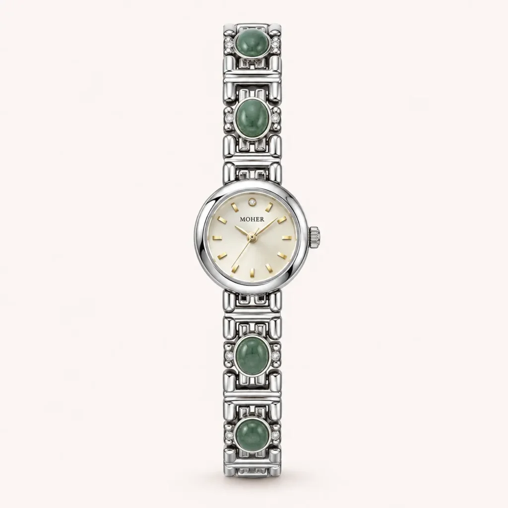
Silver-tone metal offers another direction for green. If you prefer a cooler overall palette, it can connect the stone to gray tailoring, a white shirt, or silver-colored jewelry. Pay attention to the particular shade of green: pale, muted green will create a different impression from a deep, saturated shade. Consider the actual watch rather than choosing from the word “jade” alone. If this cooler combination appeals to you, a silver-tone jade bracelet watch brings the two elements together, pairing the green of jade with a silver-colored chain for a coordinated look alongside your everyday silver jewelry.
Tiger’s Eye: Bringing Out Warm Brown and Golden Tones
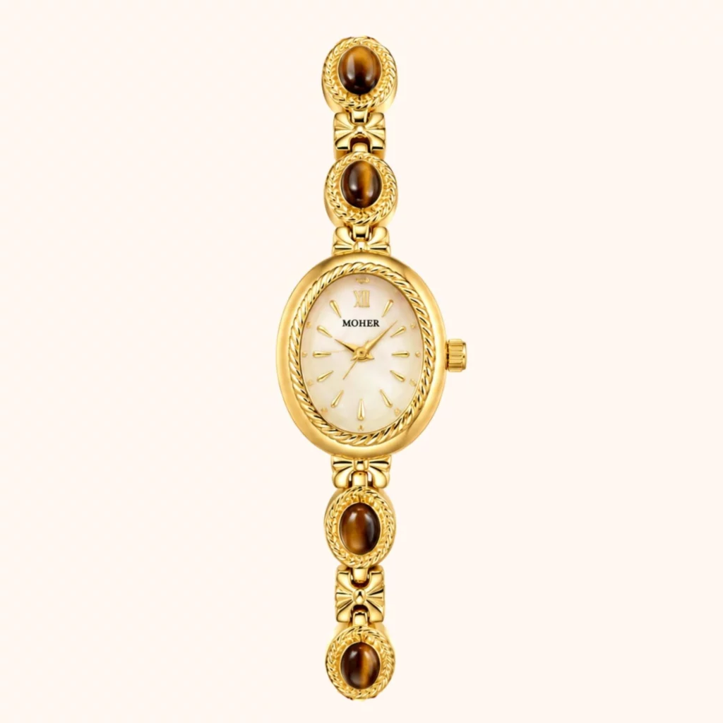
The brown and golden tones associated with tiger’s eye make it an appealing choice for a warm wardrobe. A gold-tone setting can repeat those colors, helping the bracelet read as a connected composition rather than separate pieces competing for attention.
Imagine a camel knit, dark trousers, and a brown bag. A tiger’s eye bracelet watch can pick up the warmth already present in the outfit, while its metal details add definition. You do not need every brown to match exactly; related shades can make the combination feel more relaxed.
A pale dial can provide a useful visual pause among richer bracelet colors. In a watch combining tiger’s eye with mother-of-pearl, the contrast between darker stone elements and a light dial becomes part of the design’s appeal.
Cat’s Eye: Let the Actual Color Guide You
For a watch described as featuring cat’s eye, begin with the actual color shown in its product photographs. A pale gray element may lead you toward a cooler combination, while a creamy or honey-colored detail may encourage a warmer one. The name alone does not tell you which metal will suit your wardrobe.
You can also choose contrast deliberately. Soft gray details surrounded by gold-tone metal may appeal to someone who wants warmth without a strongly colored stone. In a silver-tone design, similar details may create a more continuous, understated palette. For a softer mix of colors, this silver-tone cat’s eye bracelet watch combines pale blue, green, and pink accents within a silver-colored chain. The metal gives the different shades a consistent frame, while the warm-toned dial adds a gentle contrast—an option if you enjoy subtle color without choosing just one shade.
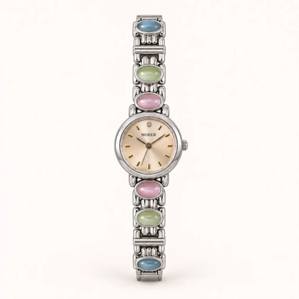
Check the material description separately from the styling decision. A product’s appearance or use of the term “cat’s eye” does not by itself establish that it contains a natural gemstone. For choosing the color, however, the practical question remains simple: do you prefer the way the metal blends with the detail, or the way it frames it?
3. Pearls and Mother-of-Pearl: Choosing Around a Softer Glow
Pearls and mother-of-pearl offer another way to introduce natural material into a watch design. Although they come from mollusks rather than being mined mineral stones, they belong naturally in a discussion of jewelry-style watches. Their visual appeal often centers on luster and subtle color rather than a bold block of color.
For a pearl bracelet watch, gold-tone details can create a warm, gentle combination, particularly alongside cream clothing or gold-colored earrings. Silver-tone details can take the look in a cooler direction, connecting easily with white, gray, or pale blue. The result also depends on the pearls’ actual shade and on how much metal is visible between them.
Pearls do not have to be reserved for formal clothing. With a simple knit or an open-collar shirt, a pearl-detail watch can provide a decorative touch while keeping the rest of the outfit straightforward.
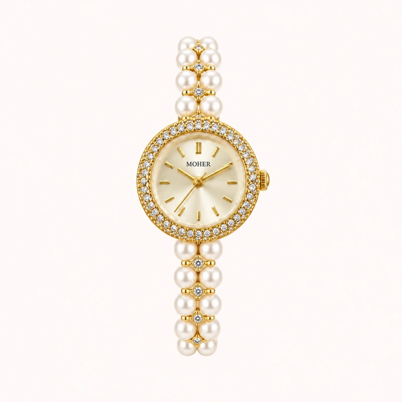
With mother-of-pearl, consider the dial’s base color as well as the tones visible in its reflections. A green mother-of-pearl dial and a silver-tone bracelet can create a fresh, coordinated palette. That combination is easy to imagine against a white shirt, with the dial providing color while the bracelet connects to simple silver-colored accessories.
Blue or green mother-of-pearl can also work with gold-tone metal. The cooler color and warmer frame provide contrast rather than a close match. If you love a particular dial, compare the whole composition before deciding that its color requires one metal finish.
4. Use Skin Tone as a Clue, Not a Rule
Skin tone can help you explore options, but it does not need to determine what you are allowed to wear. You may enjoy the way warm gold-tone metal sits against your skin, or prefer the contrast created by silver-tone metal. Both responses are valid reasons to choose a watch.
Begin with jewelry you already own. If there is a ring or bracelet you consistently like on your hand, its metal color gives you a useful reference. Then consider how the watch’s stone changes the picture. A gold-tone watch with a large green element will not look the same as an entirely gold-colored bracelet.
When possible, compare options in natural daylight while wearing a familiar outfit. Look at your whole wrist and sleeve together rather than focusing only on a close-up of the case. Warm indoor lighting can change your impression of the colors, and an enlarged product photo can make decorative details seem more dominant than they are when worn.
Notice what you want from the result. Do you prefer an accessory that blends gently with your skin and clothing, or one that stands out? Is the first thing you see the stone, the metal, or the overall bracelet shape? These observations are more useful than treating an undertone label as a final answer.
If both metal colors appeal to you, let your existing jewelry and wardrobe break the tie.
5. Match Your Watch to the Jewelry You Already Wear
A new watch is easier to wear regularly when it has something in common with your favorite accessories. Your everyday rings and earrings are a good place to begin because they already reflect choices you feel comfortable making.
If most of your jewelry is gold-colored, a gold-tone gemstone watch creates an immediate connection. The stone can then introduce variety. You might keep the metal consistent across your earrings, ring, and watch while using a blue dial or green bracelet detail as the only strong color.
For example, a blue mother-of-pearl dial surrounded by gold-tone metal can connect to simple gold-colored jewelry while adding a cooler accent. That is useful when you want a watch to feel familiar alongside what you own, but still bring something distinctive to the outfit.
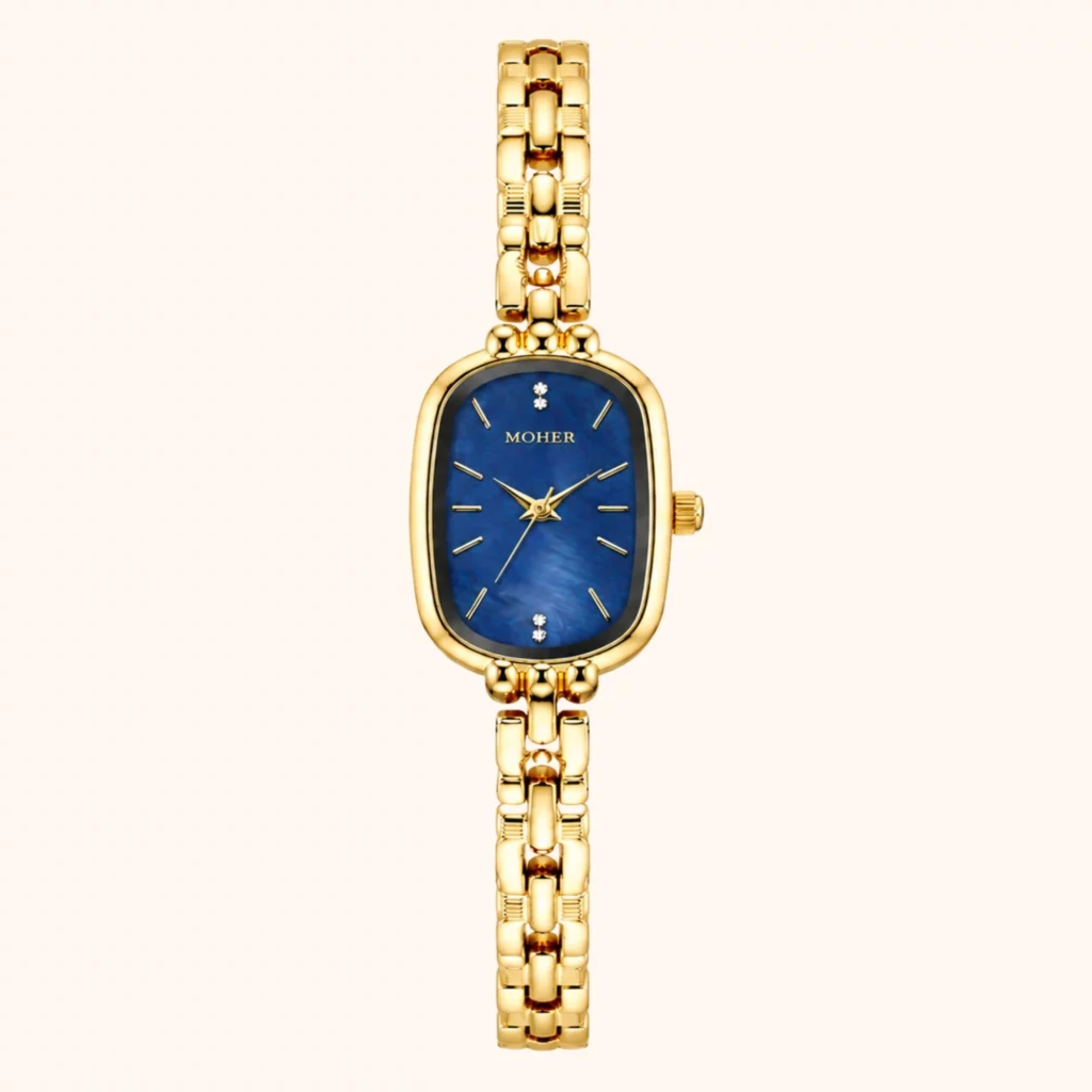
If your regular accessories are silver-colored, a silver-tone watch offers the same kind of continuity. You can choose a subtle dial for a quiet look or a more noticeable color when you want the watch to become the focal point.
Mixed metals can work too. Repeating each metal somewhere in the outfit can make the combination feel deliberate: a gold-tone watch might sit alongside a ring that contains both colors, for example. You do not need every accessory to match exactly.
Keep the amount of decoration in mind. An intricate gemstone bracelet watch may feel complete with only a simple ring. If you add bracelets on the same wrist, leave room for movement and avoid pieces that repeatedly knock or scrape against the watch.
6. Choose a Combination That Works with Your Wardrobe
Think about the clothes you wear in an ordinary week. A watch that works with several familiar outfits is more likely to become part of your routine than one chosen around a single imagined occasion.
Cream, Beige, Camel, and Brown
Warm neutrals provide a natural starting point for gold-tone metal. Tiger’s eye can continue the brown palette, pearl details can keep the combination gentle, and green jade can introduce a clearer color accent. With a cream blouse and camel trousers, decide whether you want the watch to blend into the warmth or provide a small green focal point.
White, Gray, Blue, and Navy
Silver-tone metal can connect easily with cooler clothing colors. A pale green mother-of-pearl dial might add interest to a white shirt without dominating it. With navy knitwear, a lighter dial can create a visible point of contrast. Gold-tone metal also works with these colors if you prefer a warmer accent against the cooler fabric.
Black and Other Dark Colors
Dark clothing gives either metal finish room to stand out. Gold-tone metal with green jade can create a rich contrast, while silver-tone metal with pale details can look crisp. For an evening meal, you might let the watch provide most of the wrist decoration. For work, a slimmer bracelet and fewer additional accessories can keep the same color idea more restrained.
Prints and Multicolored Outfits
Choose one smaller color from the print and echo it in the watch. A blouse with a little green in its pattern may work with jade or a green dial; a print containing warm browns may connect with tiger’s eye. The match can be approximate. Repeating the general color direction is often enough to create a relationship.
Before deciding, picture the watch with three outfits you already wear: one for work, one for a relaxed day, and one for going out. If the combination feels right in all three, you have a practical reason to choose it.
7. Frequently Asked Questions About Gold and Silver Gemstone Watches
Does Green Jade Look Better with Gold or Silver?
Either can work. Gold-tone metal adds warmth and can create a noticeable frame around green jade, while silver-tone metal offers a cooler pairing. Consider the shade of the jade, the amount of visible metal, and your regular clothing colors. If you mostly wear warm neutrals and gold-colored jewelry, gold-tone metal is an easy starting point; a cooler wardrobe may make silver-tone metal easier to coordinate.
Can I Wear a Gold-Tone Gemstone Watch with Silver Jewelry?
Yes. A deliberate connection can help the combination feel balanced. You might repeat the watch’s gold color in a small earring detail or wear a ring containing both metal colors. You can also keep the rest of the jewelry simple and let the watch stand on its own. Avoid adding extra pieces solely to force a match if you prefer a quieter look.
Which Is More Versatile: a Gold-Tone or Silver-Tone Watch?
The more versatile option is usually the one that works with your own wardrobe and jewelry. Gold-tone metal may fit easily into a collection of camel clothing and warm accessories, while silver-tone metal may connect naturally with gray, blue, and silver-colored pieces. Stone color matters too: evaluate the full watch, not just its finish, and imagine wearing it with several existing outfits before choosing.
Should My Watch Match My Ring or My Outfit?
Start with whichever is more constant. If you wear the same ring every day, its color provides a useful anchor. Then consider whether the watch’s stone suits your usual clothes. If you change your jewelry frequently, your wardrobe may be the better guide. Exact matching is optional; a repeated metal color or a related shade can create enough connection for the outfit to feel considered.
Choose the Combination You’ll Enjoy Wearing Most
Begin with the stone color that attracts you, look at the jewelry you already enjoy wearing, and then picture the watch alongside your everyday clothes. Gold-tone metal can add warmth; silver-tone metal can provide a cooler frame. The stone, dial, and bracelet design bring those choices to life.
The right gemstone watch should feel easy to reach for. When its colors fit your taste and routine, it can give you the useful familiarity of a watch and the pleasure of a decorative bracelet in one piece—whether you are dressing for work, meeting friends, or simply making an ordinary day feel a little more polished.